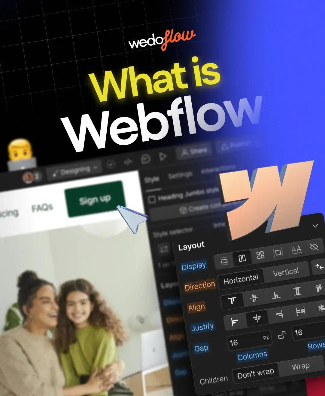
Professional Fonts for Your Professional Website
In the digital age, where first impressions often happen online, your website serves as a crucial introduction to your brand. Just like a well-tailored suit in a face-to-face meeting, a professionally designed website creates a positive first impression and fosters trust with your audience. But beyond aesthetics, one often-overlooked detail plays a significant role in shaping this perception: the fonts you choose.
Fonts are more than just visual elements; they subtly communicate your brand's personality and values. Selecting the right professional fonts for your website can elevate its look and feel, making it appear credible, trustworthy, and aligned with your brand identity.
What are professional fonts?
Professional fonts are typefaces that are commonly used in professional settings such as businesses, publications, and websites. These professional fonts for business, publications, etc, are chosen for their readability, versatility, and aesthetic appeal, and they often convey a sense of sophistication and professionalism.
We mentioned that they are “typefaces”, and perhaps some of you might be asking “What is the difference between a font and a typeface?”. Well to put it simply, a font is part of a typeface, whereas a typeface is the font-family where the bold fonts, thin fonts, and other versions of that specific font design “live together”.
For instance, Roboto, Helvetica, and Garamond are typefaces, whereas Roboto bold or Roboto thin, Helvetica light, Helvetica normal, and the like are fonts. In other words, typefaces include a set of fonts that share similarities in their design features; like shape, width spacing, serifs, and more.
Serif vs. Sans-serif: Understanding the font landscape
While the typeface vs. font distinction is important, serif vs. sans-serif is also another critical element you have to be aware of when we are talking about fonts.
In general, fonts can be broadly categorized into two main groups: serif and sans-serif.
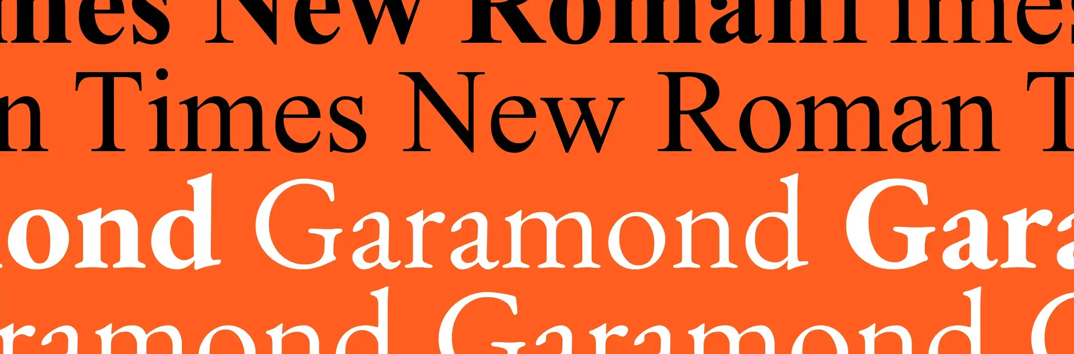
Serif fonts are characterized by small decorative strokes at the ends of their letterforms, often associated with a traditional and timeless aesthetic. Examples include Garamond and Times New Roman.
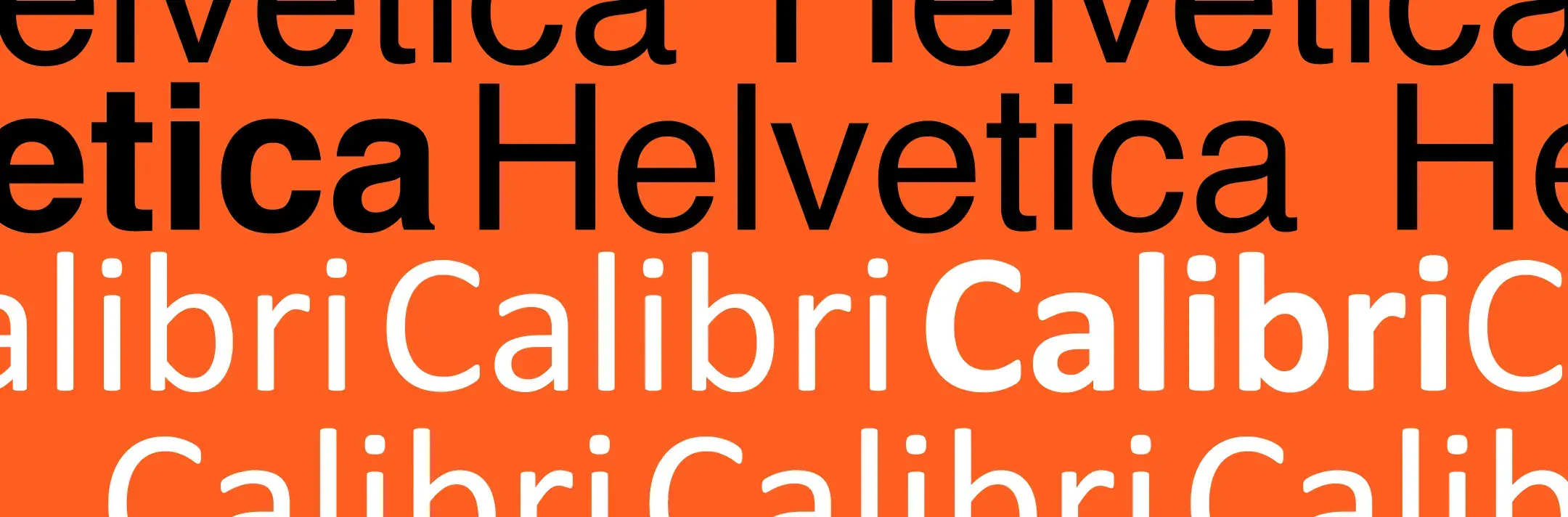
Sans-serif fonts, on the other hand, lack these decorative elements, resulting in a cleaner and more modern appearance. Popular examples of sans-serif fonts include Helvetica and Calibri.
In general, serif fonts tend to evoke feelings of trust, sophistication, and tradition, making them ideal for websites in industries like law, finance, or education. Conversely, sans-serif fonts project a sense of modernity, simplicity, and clarity, often favored by tech companies, startups, and creative agencies.
In addition to serif and sans-serif fonts, there are also numerous other font type categories and sub-categories, such as monospaced fonts and handwritten fonts (calligraphy fonts, cursive fonts, etc). While the latter occupy specific niches for their usage, serif and sans-serif fonts constitute the main categories widely used in our daily lives. From traditionally in books and newspapers to web design and plentiful other usages today in the digital sphere.
Top 20 Choices for Professional Fonts
After we went through various font options, we thought that compiling a set of 10 serif and sans-serif fonts would offer a comprehensive representation for each category. So, read through our selection below!
Best 10 Serif fonts:
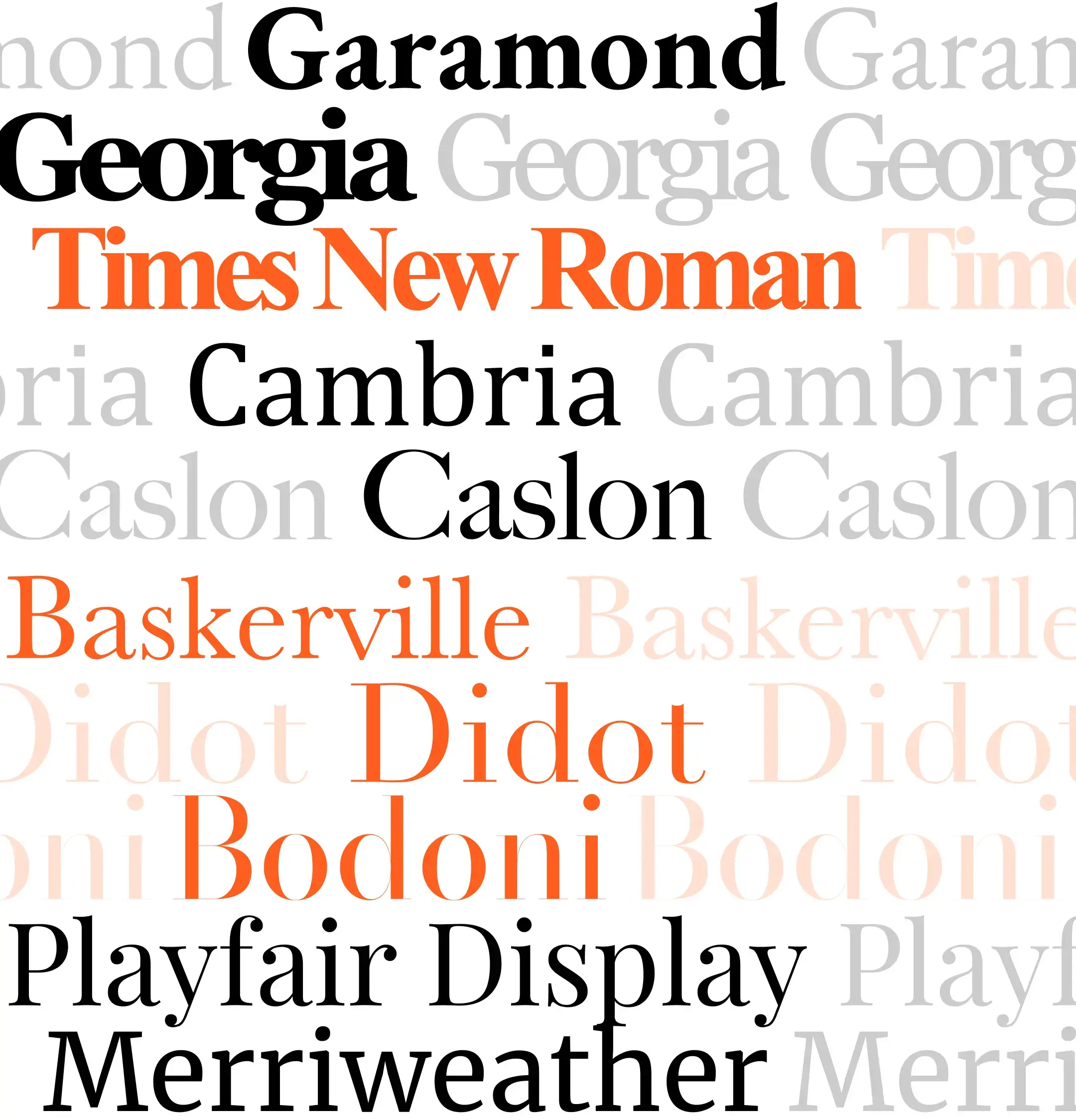
- Garamond: This classic serif font offers excellent readability and a touch of elegance, making it suitable for websites aiming to convey both professionalism and approachability.
- Georgia: A beautiful font designed specifically for on-screen reading, Georgia strikes a balance between formality and legibility, making it a popular choice for websites with a focus on content.
- Times New Roman: While often associated with traditional print media, Times New Roman can still be effective for websites that require a highly formal and authoritative tone.
- Cambria: This serif font has a modern and professional look, often used for business documents and presentations.
- Caslon: A beautiful historic serif typeface that has a timeless and elegant font design, often seen in traditional printing and branding.
- Baskerville: A professional serif font that features a high contrast between thick and thin strokes, offering a clear and refined aesthetic.
- Didot: This font features a high contrast between thick and thin strokes, resulting in a stylish and dramatic look. It's often used for headlines, logos, and high-fashion branding.
- Bodoni: Similar to Didot, Bodoni has a high contrast but with a slightly sharper and more geometric appearance. It works well for editorial design, book covers, and posters.
- Playfair Display: This stylish and elegant font has a classic feel and is often used in branding, wedding invitations, and marketing materials.
- Merriweather: A versatile serif font with good readability, making it suitable for websites, books, and editorial design.
Best 10 Sans-serif fonts:
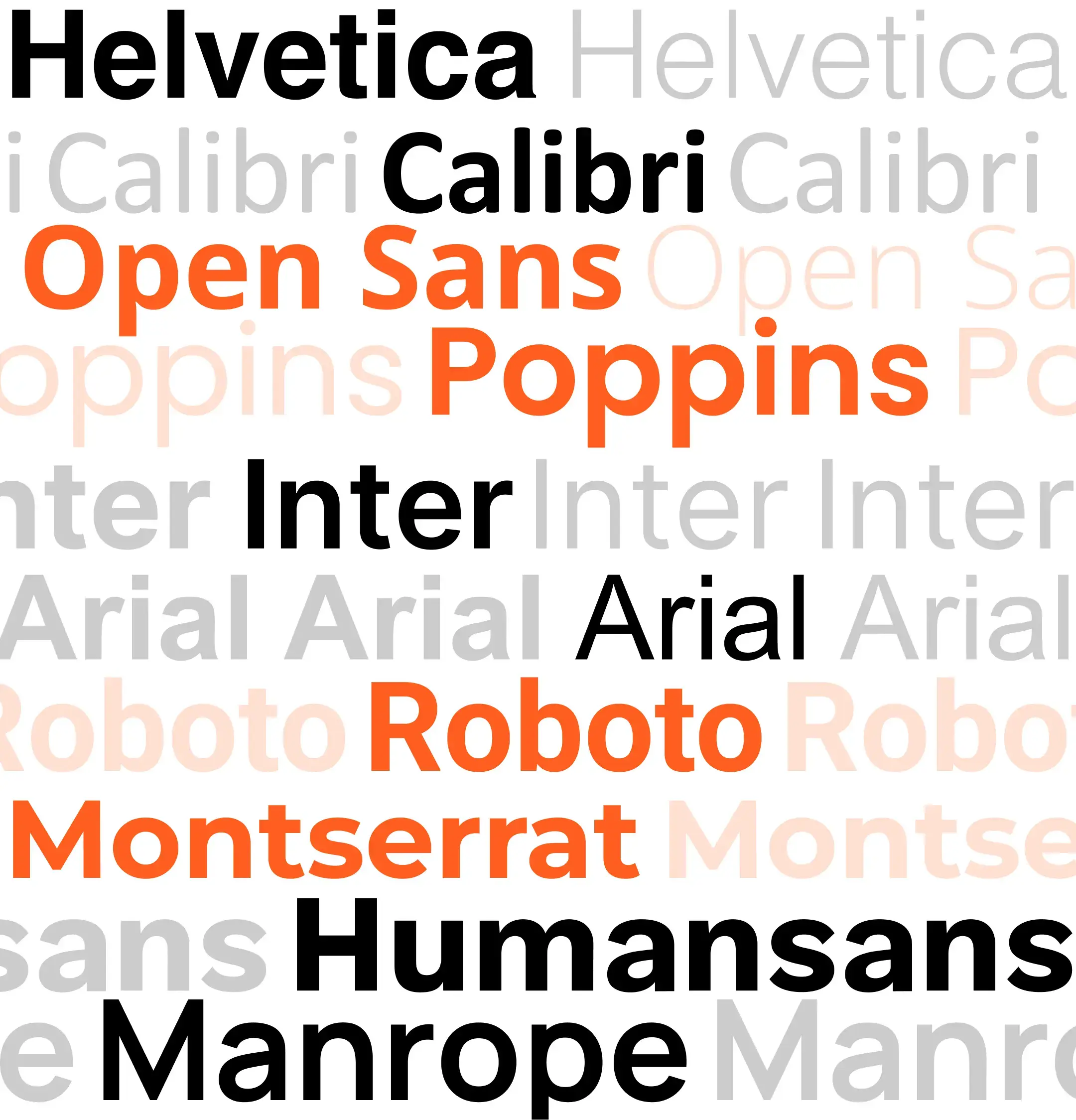
- Helvetica: This widely used sans-serif font is known for its clean lines, neutrality, and exceptional legibility, making it a versatile choice for websites across various industries.
- Calibri: A modern yet professional sans-serif font pre-installed on most devices, Calibri offers good readability and aligns well with a corporate or business setting.
- Open Sans: Open Sans is a free, open-source professional sans-serif font designed for readability and flexibility. Its clean and professional character makes it suitable for websites of all types.
- Popins: This is a relatively new typeface designed by Indian Type Foundry. It stands out for its clean and geometric appearance, offering a modern and professional feel.
- Inter: A variable sans-serif font family designed by Rasmus Andersson in 2016. It was specifically crafted for computer screens and features a tall x-height to improve the legibility of both lowercase and mixed-case text at smaller sizes.
- Arial: Similar to Helvetica, Arial is a clean and versatile sans-serif font commonly used in web design, documents, and user interfaces.
- Roboto: Developed by Google, Roboto is a clean and geometric sans-serif typeface commonly used in Android devices and various digital platforms.
- Montserrat: This modern sans-serif font has a friendly and approachable feel, making it suitable for branding, websites, and marketing materials.
- Humansans: A versatile and user-friendly sans-serif font characterized by its clean elegant lines, high readability, and neutral aesthetic.
- Manrope: Manrope is a modern sans-serif typeface with clean, rounded letterforms and balanced proportions, ideal for a variety of design applications seeking clarity and versatility.
How to choose the right font for your brand?
While these are some top aesthetic fonts we mentioned, the ideal font choice for your website goes beyond aesthetics. Your font selection should resonate with your brand identity and effectively communicate your message to your target audience.
Here's how to choose the right font:
- Consider your brand personality: Is your brand classic and sophisticated, or modern and innovative? Choose a font that aligns with those characteristics.
- Think about your target audience: Who are you trying to reach? Understanding their preferences can help you select a font that resonates with them.
- Prioritize readability: Above all, your website's font should be easy to read on all devices, regardless of screen size.
Ultimately, some of our font ideas sometimes don’t perform as we expect, so the best way to choose your fonts is to experiment and see what is the best fit for your brand.
What to consider when choosing fonts for your design?
Choosing your fonts sometimes can be challenging, so have these additional considerations in mind to guide you through the process:
- Limit the number of fonts: Using too many fonts can create clutter and detract from your website's professionalism. Stick to 2-3 fonts to maintain consistency and visual harmony.
- Font combinations: Consider using a combination of a serif font for headings and a sans-serif font for body text (other combinations are also fine), and weights (bold vs. light) to create visual hierarchy and make a clear distinction between headings and body text enhancing readability.
- Mood and Tone: Choose fonts that evoke the desired feeling for your design (e.g., classic, modern, playful).
- Free vs. paid fonts: While many free fonts are available, some paid fonts offer higher quality and unique styles that can contribute to your brand's distinctiveness. Weigh the pros and cons based on your needs and budget.
Fonts that go well together — Three of our top font combination picks
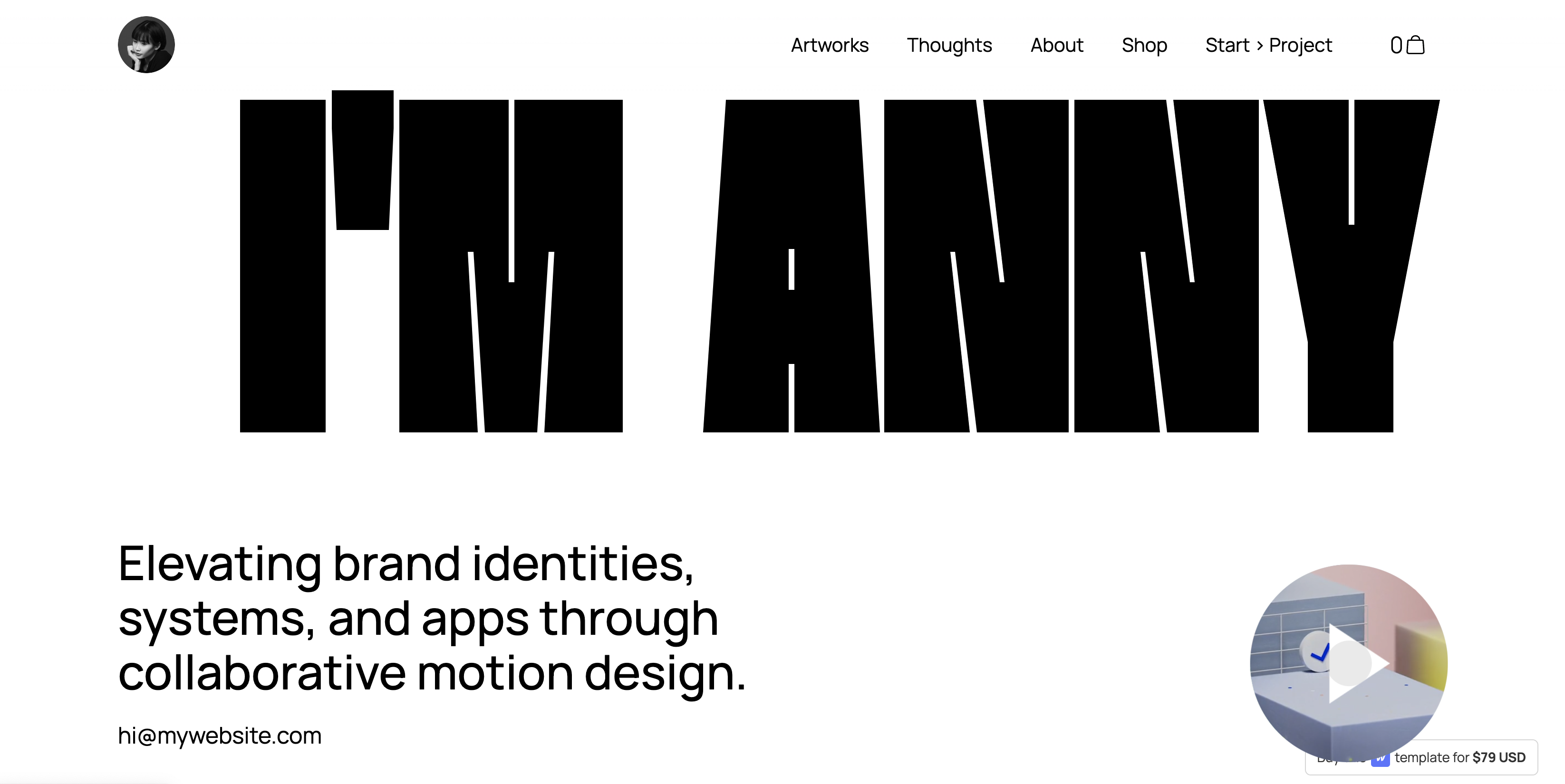
1. Bricolage Grotesque & Humansans
Heading Font: Bricolage Grotesque
Body Text Font: Humansans
This combination offers a unique and contemporary feel, with Bricolage Grotesque providing a bold and eye-catching heading font, complemented by the clean and modern appearance of Humansans for body text. It's suitable for websites, posters, and branding projects.
2. Poppins & Inter
Heading Font: Poppins
Body Text Font: Inter

Poppins' versatility and geometric shapes pair well with Inter's simplicity and readability. This combination is ideal for digital interfaces, such as websites and apps, as well as for brochures and flyers where clarity and modernity are essential.
3. Thunder & Manrope
Heading Font: Thunder
Body Text Font: Manrope
Thunder's bold and impactful presence makes it perfect for headings, while Manrope's clean and straightforward design ensures readability for body text. This combination works well for posters, banners, branding materials, or personal portfolios, giving a strong visual identity to your designs.
Font inspiration sources
If you are still undecided about what font to use, you might want to look for some inspiration! Here are a few resources that will spark your creativity:
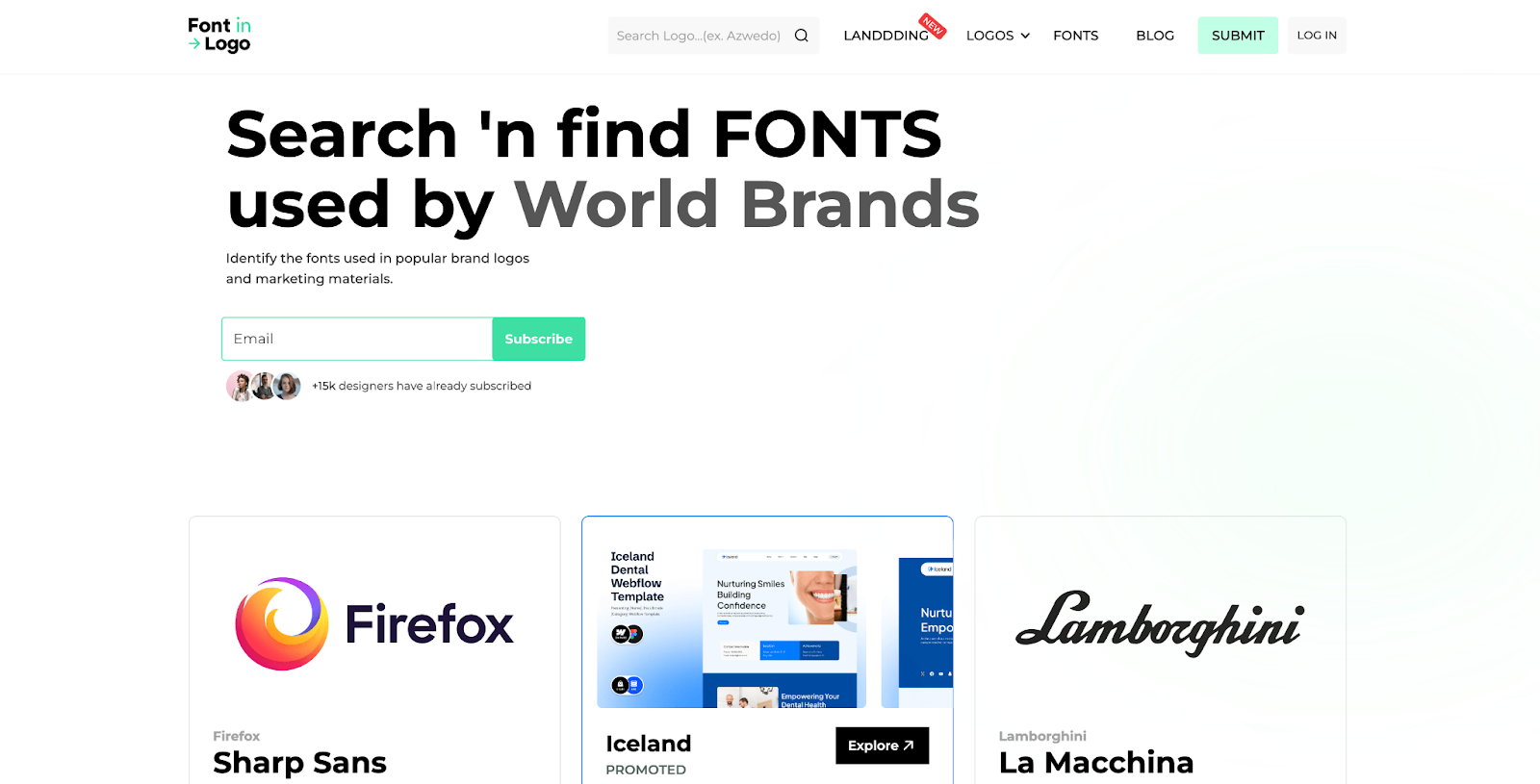
Font in logo: This website is an awesome place to search and find what fonts the world's biggest brands chose for their logos. From the big social media companies' logo fonts to famous designers, car brands, and sports teams' logo font choices, you’ll find them all here with a simple search.
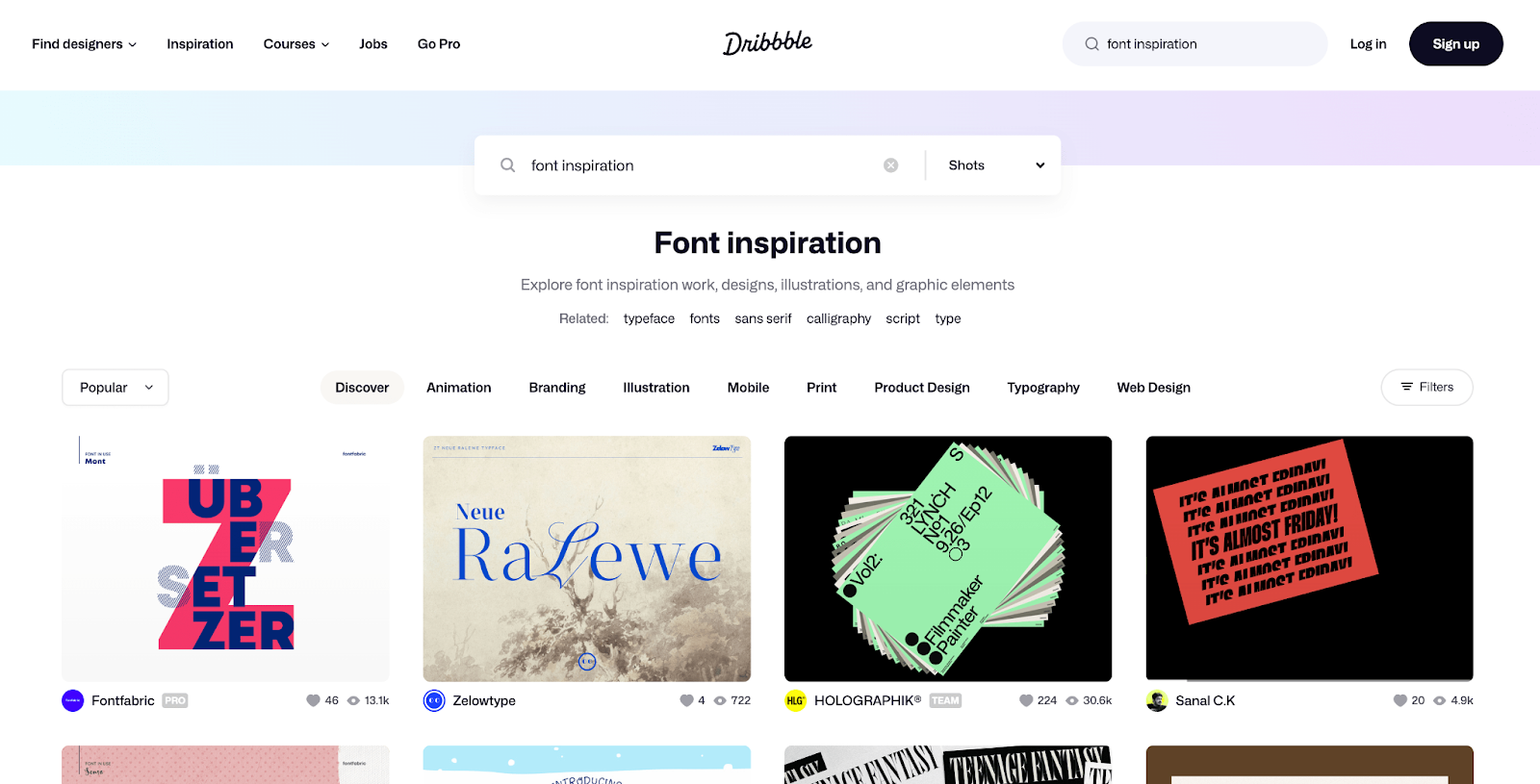
Dribbble: A community of designers showcasing their work, often featuring creative font combinations and typography projects.
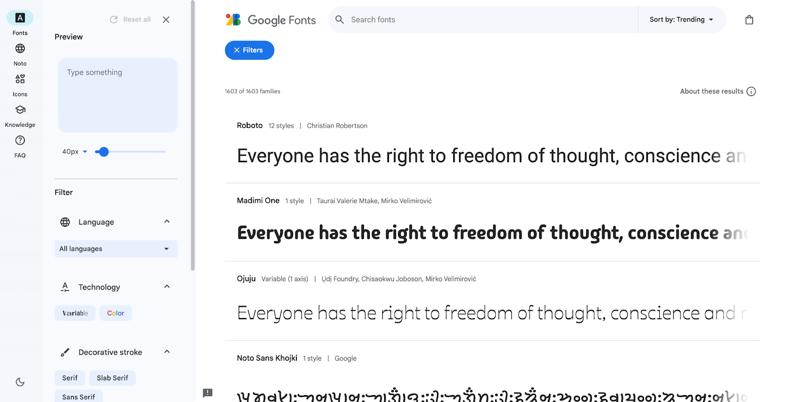
Google Fonts: If you want to do a thorough exploration of font choices, Google Fonts is a vast library of free, open-source fonts, featuring various styles and classifications that will suit your needs.
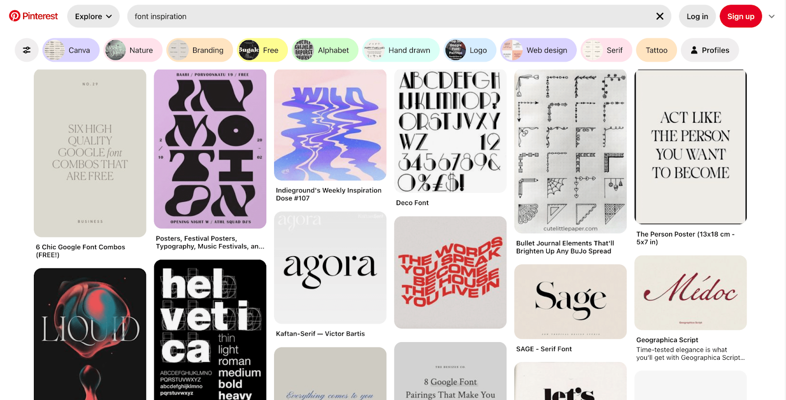
Pinterest: Search for "font inspiration" and discover countless curated boards brimming with beautiful font pairings, design concepts, and trends.
Conclusion
Professional fonts are an essential element in crafting a website that reflects your brand's professionalism and credibility. By understanding the difference between serif and sans-serif fonts, considering your brand identity and target audience, and following key guidelines, you can choose the perfect fonts to elevate your website and make a lasting impression on your visitors.
Remember, your website is an extension of your brand, and the fonts you choose play a crucial role in shaping its image and engaging your audience. So, explore different options, experiment wisely, and find the perfect fonts to tell your brand story effectively.
For more articles like this, visit our blog and follow our socials for the latest news and updates in the world of web design!


-76d50c8c322d.jpg)