How to Adapt Webflow Template Typography to a Real Brand

A Webflow template can look convincing before it contains a single sentence from your client. Then the real material arrives: a longer company name, a three-line service description, a pricing qualifier and a collection of articles written by different people. Suddenly, the typography that looked effortless in the demo needs decisions.
For designers choosing templates from collections such as WeDoFlow, this is a useful moment to treat typography as part of implementation. The goal is a website that can carry the client’s actual message and remain manageable after handover. This walkthrough follows a template from its first content audit to an editor-ready release, with practical checks for each stage.
Begin with the page that is hardest to fit
Do not start by restyling the homepage hero. Find the page with the widest range of content: a service detail page, a pricing page or a CMS article. Add representative copy before changing fonts. Include the longest plausible heading and a paragraph that explains something complicated. A forgiving demo page can hide problems that this sample will expose immediately.
Keep a copy of the original template for comparison, then record the text roles you find. Look for the main heading, section headings, paragraphs, navigation, buttons, captions and form labels. Note whether they share a class or use separate treatments. You are mapping the existing system so that a change made in one place does not unexpectedly alter another.
| Content role | Test with real material | What to inspect |
|---|---|---|
| Hero heading | The longest approved value proposition | Wrapping, width and surrounding space |
| Navigation | Actual page names | Fit and clarity at narrower widths |
| CMS body | Paragraphs, lists and a quotation | Consistent rhythm and emphasis |
| Action label | A specific next step | Padding and room for longer wording |
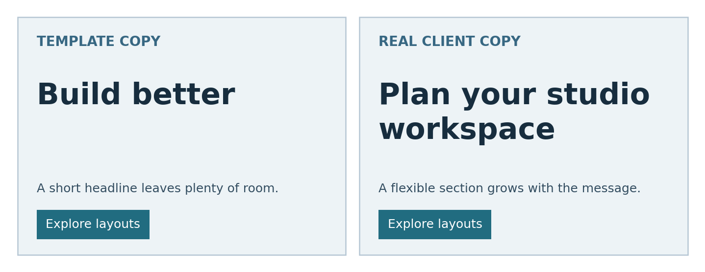
An easy mistake is to approve a heading with “Build better” and assume that “Plan your studio workspace” will behave the same way. The second message needs more room. Let the section accommodate it, or revise the composition. Making all headings smaller to rescue one phrase can weaken the hierarchy throughout the site.
Separate the brand decision from the styling decision
Before importing files, write a short brief for the typeface. Describe its job in concrete terms: confident headings, comfortable article reading, clear numerals in prices, and support for the languages the client will publish. Include the characters used in company names and locations. A beautiful specimen is only a starting point; the actual vocabulary is the test.
Compare families using identical content
Set the same heading, paragraph, price and button label in each candidate. Keep the available width comparable, but allow optical adjustments to size: two fonts at the same numeric size can look substantially different. Judge the relationship between roles, not just the appearance of a single word. Review the candidate on an ordinary laptop and a phone rather than only on a large design monitor.
Limit the initial selection. One versatile family may cover the project, while a second can give short headings a distinct character. Adding families for every section makes the website harder to maintain and creates more decisions for future editors. Establish a reason for each addition before making it part of the template.
Use real custom projects as briefing examples
Crocs provides a relevant example of a website-specific font adaptation. TypeType’s published case identifies a customised TT Norms® Pro developed for the company’s website. The useful lesson for a smaller project is to describe the intended environment clearly. A web brief should name the text roles and content requirements instead of asking only for a font that “feels like the brand”.
SHIFTBRAIN offers another example. Its twentieth-anniversary website used SHIFTBRAIN Norms Variable, a customised version of TT Norms® Pro. That project illustrates how a distinctive digital experience can call for a specific typographic treatment. These cases describe font use; they do not establish that either website was built in Webflow or demonstrate a measured conversion improvement.
Most template projects can begin with an appropriately licensed existing family. Customisation becomes a discussion when the team can identify a recurring requirement that available options do not satisfy. The case study is a prompt for a better brief, not a reason to commission bespoke work automatically.
Connect the chosen family to the existing style system
Webflow’s custom-font guide places uploads in Site settings under Fonts and recommends WOFF2 for web use. Prepare the approved files and identify their weights before uploading. Name the files and styles clearly enough that a future teammate can tell regular, medium and bold apart. Avoid importing an entire collection simply because it is available.
Next, decide which typography belongs at the HTML tag level and which belongs in reusable classes. Webflow’s typography guidance distinguishes these mechanisms: tag styling establishes defaults, while classes provide reusable treatments that can override them. Inspect the template’s existing organisation before adding a second, competing set of rules.
Webflow puts the purpose of headings succinctly: “Think of headings as content guides”. Use that principle when editing a template. A heading’s semantic level should reflect the document structure; its visual appearance can be adjusted through styling. Do not choose a lower-level heading solely because its default size happens to fit.
A common error is to change a shared class while looking at only one section. The correction can then affect multiple pages. After each shared-style change, inspect representative uses elsewhere in the site. If one component genuinely needs a different treatment, document that exception instead of quietly creating another almost-identical global rule.
Give CMS content its own rehearsal
A landing page may be assembled carefully by a designer, but a CMS article will be populated repeatedly by editors. Webflow’s Rich Text Element supports long-form content with headings, paragraphs, lists, quotations and other elements. Test that range rather than approving a sample containing only plain paragraphs.
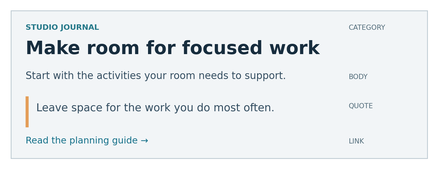
Create one rehearsal article with a descriptive title, two subheading levels, a numbered procedure, a bulleted list, a quotation and a link. Include a long link label and an unusually short paragraph. Check the spaces before and after each element. A heading should visibly introduce what follows, while a quotation should remain connected to its attribution.
Test content combinations as well as isolated components. A list followed immediately by a heading may need different attention from two ordinary paragraphs. An editor should not have to insert empty paragraphs to manufacture spacing. Fix recurring relationships in the styling so that the content itself stays clean.
If you copy components between Webflow sites, check the destination’s fonts. Webflow’s guidance notes that custom font families fall back when they have not been added to the destination site. The copied component may therefore look different even when its other styling appears intact. Verify the available files before attempting to repair the design with arbitrary size changes.
Review failures before polishing details
A useful review starts with visible problems and works towards their cause. Look at the page with real copy at several widths, then try longer labels and different content lengths. Treat a broken composition as evidence to investigate, not as permission to squeeze the text until the screenshot looks tidy.
| Observed problem | Tempting quick fix | More durable response |
|---|---|---|
| Heading overlaps the next section | Reduce every heading size | Review width, height and local spacing |
| Button label gets clipped | Shorten a meaningful action | Allow adequate padding and flexible sizing |
| Article styles feel inconsistent | Format each post manually | Correct the recurring rich-text styles |
| Copied component looks different | Add more style overrides | Check font availability on the destination |
Test the published preview as well as the design workspace. Ask a colleague to locate a service, interpret a price and identify the next action without coaching. Their hesitation can reveal unclear hierarchy or wording. This is a practical review, not proof that changing typography will improve business metrics.
- Review headings and buttons at narrow widths with approved copy.
- Check that links remain recognisable within paragraphs.
- Inspect form labels, error messages and confirmation text.
- Confirm that a missing or delayed font does not make the content unusable.
Resolve licensing before the client takes over
The font files used to explore a design and the rights needed for a published site are separate questions. Webflow’s upload guide tells users to “make sure you have permission to use the font on your site”. Establish that permission before treating an upload as launch-ready.
When comparing families at typetype.org, bring a brief that includes the website, expected traffic, collaborators and any related outputs. This turns licensing into a defined project requirement instead of a last-minute question about an unexplained file folder.
TypeType distinguishes Webfont licensing for website use from categories such as Desktop and App. Its webfont pricing considers monthly pageviews and duration. Check the applicable agreement for your planned use, and do not assume an evaluation file permits public deployment. Rights for a logo, app or other output should be checked separately rather than inferred from website permission.
Record who holds the licence and what the agency, freelancer and client may do with the files. If the client will maintain the site after handover, make sure the arrangement covers that workflow. Keep the agreement, purchase record and approved font versions with the project documentation. Other foundries may define their categories differently, so use the actual terms rather than a generic checklist as the authority.
Hand over a small set of usable rules
Give the client one reference page showing the approved heading, body, label, button and rich-text styles with realistic content. Explain which styles are shared and where exceptions exist. Include examples of long headings and links so that the editor can recognise an intended wrap instead of mistaking it for a defect.
The most useful handover exercise is to let the client create a new CMS entry while you observe. If they need repeated manual formatting to make it look consistent, the system needs another pass. A successful template adaptation should support the next page as well as the pages prepared for launch.
Frequently asked questions
Should every Webflow template use two font families?
No. One family with suitable weights can provide enough contrast for many sites. Add a second when it serves a defined role and remains readable in the intended layouts.
Can I keep the template’s original fonts?
Yes, if they suit the content and the relevant permissions cover your use. Review the typography with actual client copy before deciding that a replacement is necessary.
Why does a new font change the layout?
Fonts differ in character widths and other metrics. The same wording can wrap differently after replacement, so review the surrounding layout instead of expecting identical line breaks.
Does a custom font guarantee a more effective website?
No. Customisation can address specific identity or functional requirements, but effectiveness also depends on content, structure and implementation. Evaluate the actual reading and navigation tasks.
What should an editor be able to change safely?
Editors should be able to add ordinary content within documented templates without rebuilding the typography. Define the supported content types, demonstrate common tasks and explain when a design review is needed.