1 FREE Webflow template on every 2 purchases – Claim yours now! 💙🎉😍

En

Choosing the wrong colors can result in achieving opposite outcomes of what we intend. That is why web designers need to understand the meaning of colors and what they convey to the audience.
Choosing the right color is a struggle that many designers have. To help with that, designers use color theory to find the best color combinations. Color theory was established by Isaac Newton when he invented the color wheel in 1666. He investigated the dispersion of white light into a rainbow of colors.
In his conclusions, he presented his findings in the color wheel, where he separated colors into three categories:

This distinction is according to the RGB (red, green, and blue) model used in computers and other digital devices.
Still, there is also the RYB (red, yellow, and blue) color wheel model which is traditionally taught in schools and is mainly used by artists and in the printing industry, though printing now uses a more advanced model CMYK with also includes the black color.

Today, color theory is not only science but has also developed into a mix of art and psychology. It is used as a collection of rules and guidelines to aid designers in making the best choices when using color combinations.
When mixing colors using the color wheel, we get different color combinations, which are also known as color schemes or color palettes. Depending on the method used to combine colors, color schemes are divided into some categories: monochromatic, analogous, complementary, split-complementary, triadic, and tetradic.

A monochromatic scheme uses one color as a base to create different aesthetic color combinations. By using the lighter or darker tints, shades, and tones of that color, it creates designs that are pleasing to the eyes and is often used to convey a sense of serenity.

Though the similarity of the color tones might slightly make it look like a monochromatic scheme, nevertheless, the analogous color scheme includes three different colors that are next to each other in the color wheel.
On the other hand, unlike the monochromatic scheme, which can be a bit monotonous, the usage of analogous colors can be more versatile and bring harmony to the design.
A complementary color scheme uses two colors that are on opposite ends of the color wheel, it provides a bright color combination and high contrast and is also used to offer a balanced look, since one of the colors is used as an accent to complement the other.

A mix of complementary and analogous colors, it uses one base color and two next to each other colors on opposite ends of the color wheel to create a more subtle look compared to the complementary scheme whose contrast can sometimes come out too harsh on the viewer’s eyes.

The triadic color scheme uses three different colors, each is spaced at the same distance from the other in the shape of a triangle in the color wheel. This combination forms bold and diverse beautiful palettes.

The tetradic color scheme uses 4 colors at an equal distance from each other, which can either be in the form of a square or a rectangle.
Having a lot of colors may be a bit hard to balance and even may come up as distracting, but in the right design, this scheme can create unique and beautiful color palettes.

Just as we sometimes get a cultural shock when traveling to different countries and noticing their behavior regarding different situations, one such thing can also easily happen on the topic of color perception.
Even though one may say that colors are generally perceived similarly throughout the world especially today in this time of globalization, there are exceptions that if you don’t consider you could end up conveying to an audience not just a different, but a totally opposite message that you intended for.
Be it a different language, region, religious affiliation, or even current events, they all are factors that shape the understanding one perceives when is exposed to a certain color.Here are some examples to depict this phenomenon - The black color in a lot of countries and cultures is associated with mourning or grief, whereas the opposite stands true for China, Cambodia, and some other Eastern countries which use white as a mourning color.
In South Africa, on the other hand, red is used as a color for mourning, a result of the apartheid that they went through. Another example is the purple color which is used to indicate wealth and power in Japan, whereas in Ukraine it symbolizes faith, patience, and trust. This is why knowledge about color perception is very important when working in different cultures because it can have direct implications on how your brand is perceived.
Now that you got the gist of this, here are some common meanings of what colors generally convey:
Below, we will provide you with some classy color combinations from the latest trends, and also some other color palettes that we chose in our different website template design projects.
Petrol green is a soft shade of green that has great contrast with lighter pink and provides a comfortable ease of reading by not disturbing your eyes. It is very aesthetically pleasing and can be used for logos or website design.

These colors complement beautifully each other and create a nice balance. The pink showing features of femininity can be used in different website ideas, especially in the perfume and cosmetics industry. Combined with navy blue, it conveys trust and maturity.

This combination depicts a cheerful and friendly symbolism, thus it is appropriate for children-related brands because of its harmonious nature.

This is one of the most iconic and used color combinations. The high contrast that it gives makes an aesthetic look that you simply cannot go wrong with it. Its use can be various, be it in logo, website design, the gold&jewelry industry, etc.

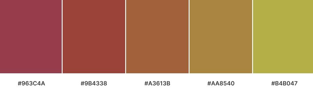
These earth colors are the perfect color combinations to use in websites with environmental-related designs. Since they represent colors we commonly find in nature, they provide a soothing and calming effect, thus transmitting a relaxing feeling.

This split-complementary combination of sky blue, ultra red, and sunny creates a beautiful color palette because it encompasses a wide range of colors and tones.
Sky blue represents the calming and serene sky, while ultra red adds a bold and vibrant touch. Sunny yellow brings warmth and happiness to the palette, creating a balanced and harmonious overall look.

Here are 5 more color palettes that we used in our web templates, in which you may find inspiration.
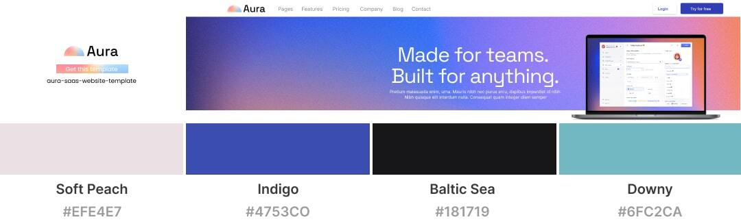
The color combination in this palette can be used to create a cohesive and harmonious environment. Soft Peach, for example, is a warm color that can be used to create a cozy and inviting atmosphere, while Indigo is a deep and rich color that can add a sense of sophistication and luxury to a design.
Together with the other colors combined, it creates a perfect palette for a web design, making the homepage look light and eye-catching.
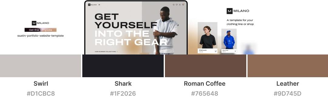
This beautiful color palette combination creates a modern and aesthetic design. These colors work well together and can be used in various design applications.

This color palette adds a sense of sophistication and elegance, it evokes feelings of excitement and through the warm colors, creates an inviting and comfortable atmosphere.
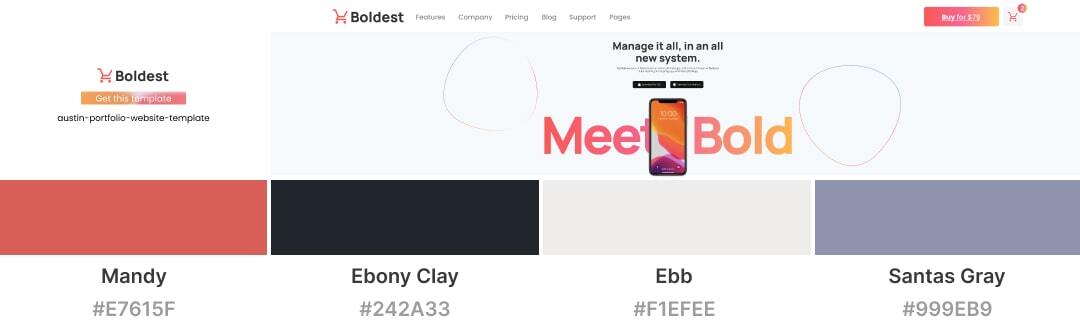
A bright color combination gives out feelings of warmth and energy. Combined with softer colors, it makes out a balanced look, and whilst yet providing good contrast, it creates an enticing design.
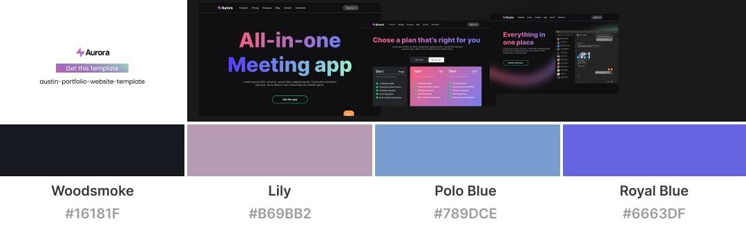
Blue, and black are classic color pairings. Combined with lily they create a modern and serious design where elements stand out beautifully from each other.
In conclusion, choosing the right color combinations in web design is extremely important. The right usage of colors helps to create a visual hierarchy, guide the user's eye to important information, and enhance the overall aesthetic of the website.
Additionally, colors can also impact the user's emotions and perception of the website, making it important to carefully select colors that align with the desired mood and brand identity.Of significant importance here is taking into account the cross-culture color perception differences and therefore choosing the right color to use in your design.
Ultimately, taking the time to choose color combinations carefully is vital for the user experience and effectiveness of a website. With over 10 years of experience in industry we can help you in choosing the right color pallet for your future project.


![Demystifying UX vs UI Design – [The Ultimate Guide]](https://assets-global.website-files.com/62c5836076839ad95e36215d/64e8b4cc1c36f5dcc119c370_UX%20vs%20UI%20(1).webp)

.jpg)
.png)

.jpg)


